
Paymentsense
Dojo Go.
How XO3D’s CGI launched Paymentsense’s new contactless payment sub-brand, replacing legacy photography with a launch-ready visual library spanning hero lifestyle, catalogue silos and macro close-ups.
The anchor render
Dojo Go, in context.
The Brief
Resolution, detail and a launch worth trusting.
Paymentsense, Europe’s largest Merchant Services provider, were launching their new sub-brand Dojo and needed a complete visual library for Dojo Go, their contactless mobile payment device.
Their existing photography couldn’t resolve the device detail at launch resolution. Macro features, screen, card slot, contactless top, weren’t reading. And they needed a consistent visual language across product page, retail listings, partner decks and paid social.
Through director-led 3D product rendering, we translated Dojo Go into a launch-ready CGI library: hero lifestyle in-hand, catalogue silos for ecommerce, macro close-ups for editorial and float renders for premium contexts. Every asset derived from one Master Asset for total visual consistency.
Project answer
Why use CGI for this project?
- What we made
XO3D built the launch visual library for Paymentsense's Dojo Go contactless payment device.
- Why CGI
The existing photography could not resolve the screen, card slot and contactless hardware at launch resolution or keep those details consistent across channels.
- What was delivered
Paymentsense received an in-hand hero image, ecommerce silos, macro close-ups and floating product renders from one Master Asset.
The Work
From lifestyle hero to macro detail, one pipeline.
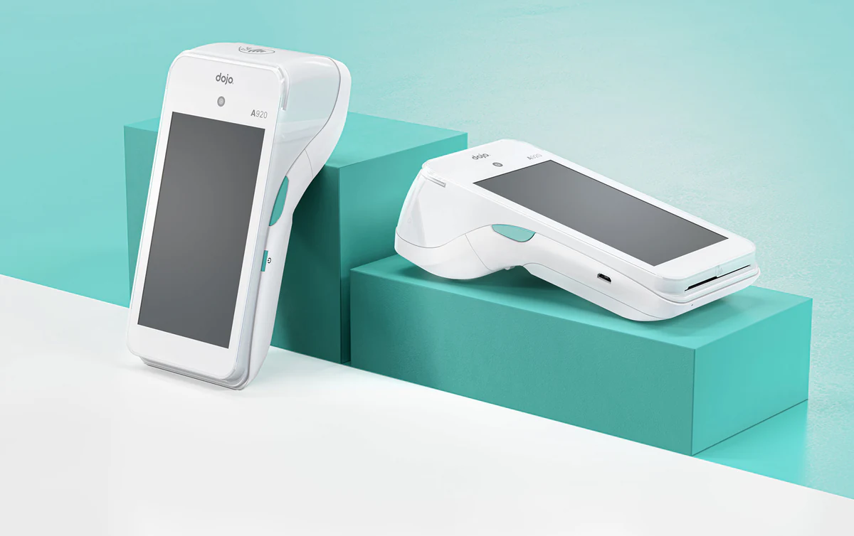
A complete CGI library: in-hand lifestyle renders, catalogue silos, macro close-ups and float compositions, all produced from one Master Asset for total visual consistency.
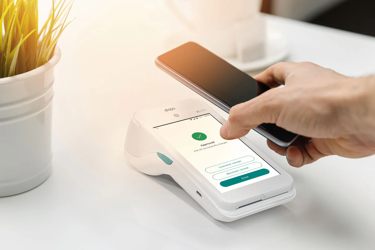
A lifestyle hero that anchors the launch.
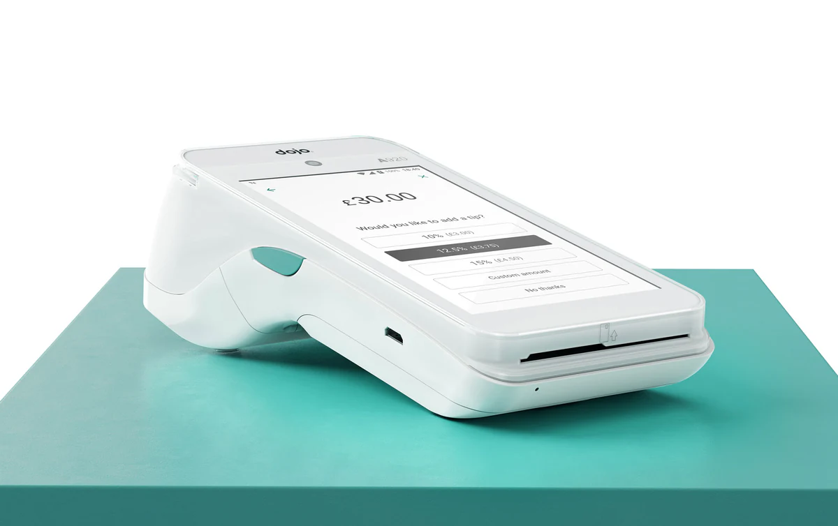
The headline render places Dojo Go in a credible in-hand context, communicating scale, portability and the contactless payment promise in a single frame built for the product page and paid social.
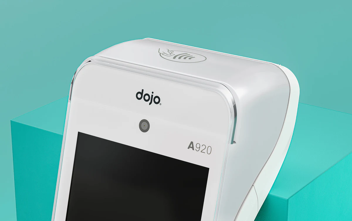
Material precision at the macro scale.
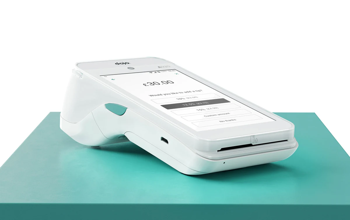
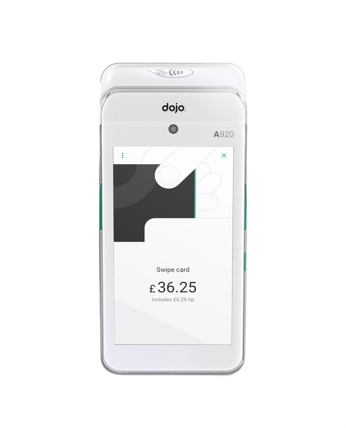
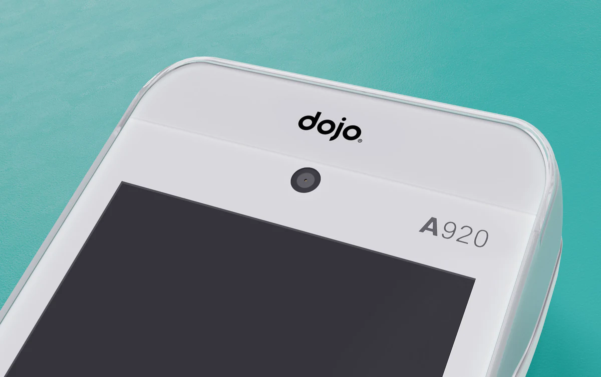
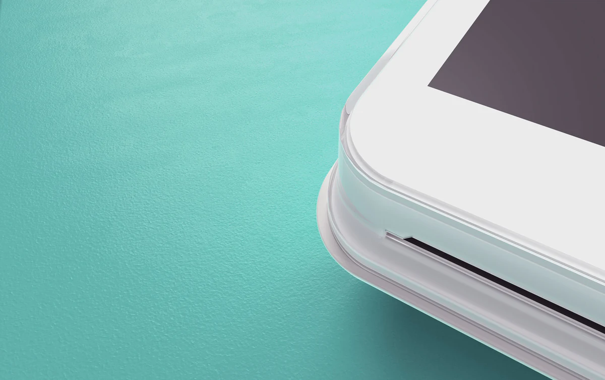
A series of close-ups on screen, contactless top and card slot, showcasing the finish quality, button detail and engineering tolerance that photography couldn’t resolve at the resolution Paymentsense needed.
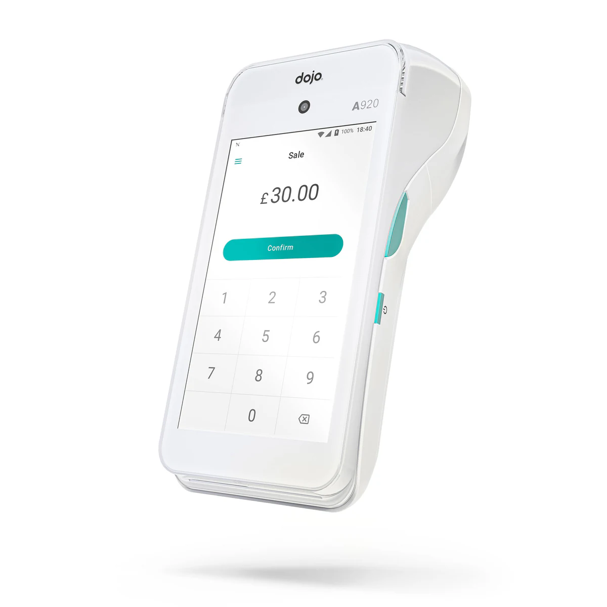
A weightless float for premium contexts.
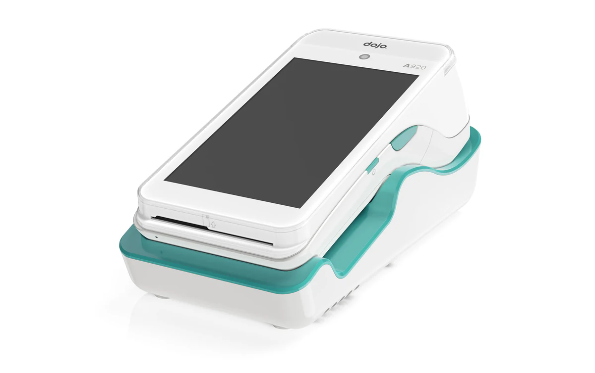
A floating render with controlled shadow and reflection, a versatile cut used inside hero banners, investor materials and editorial features where the device needs to read as premium tech, not retail kit.
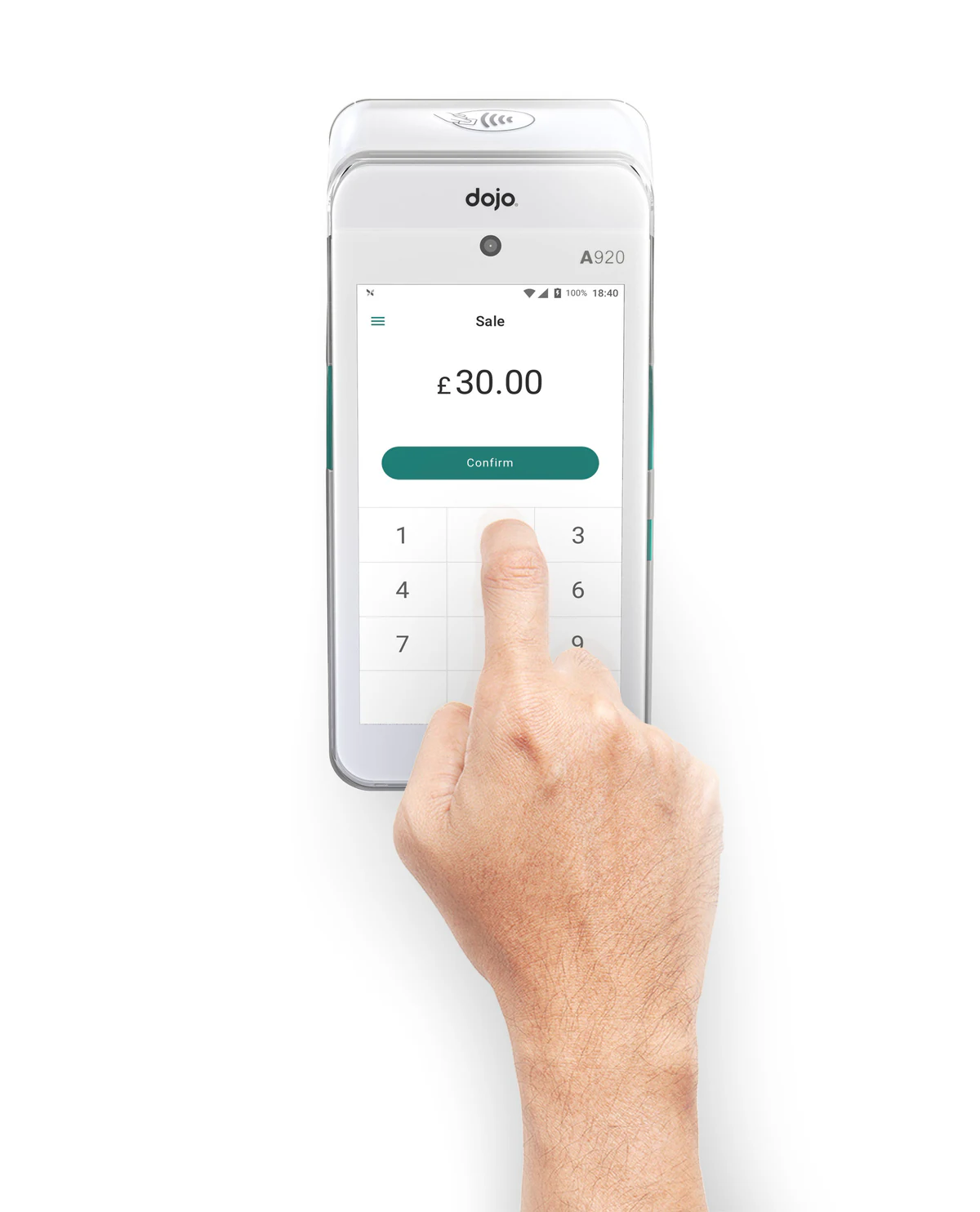
A top-down lifestyle composition.
A top-view render with hand-in-frame, engineered to communicate everyday usage, scale to the wrist and the tap-to-pay moment that defines the Dojo Go customer experience.
Catalogue Silos
Multi-angle silos for ecommerce and retail.
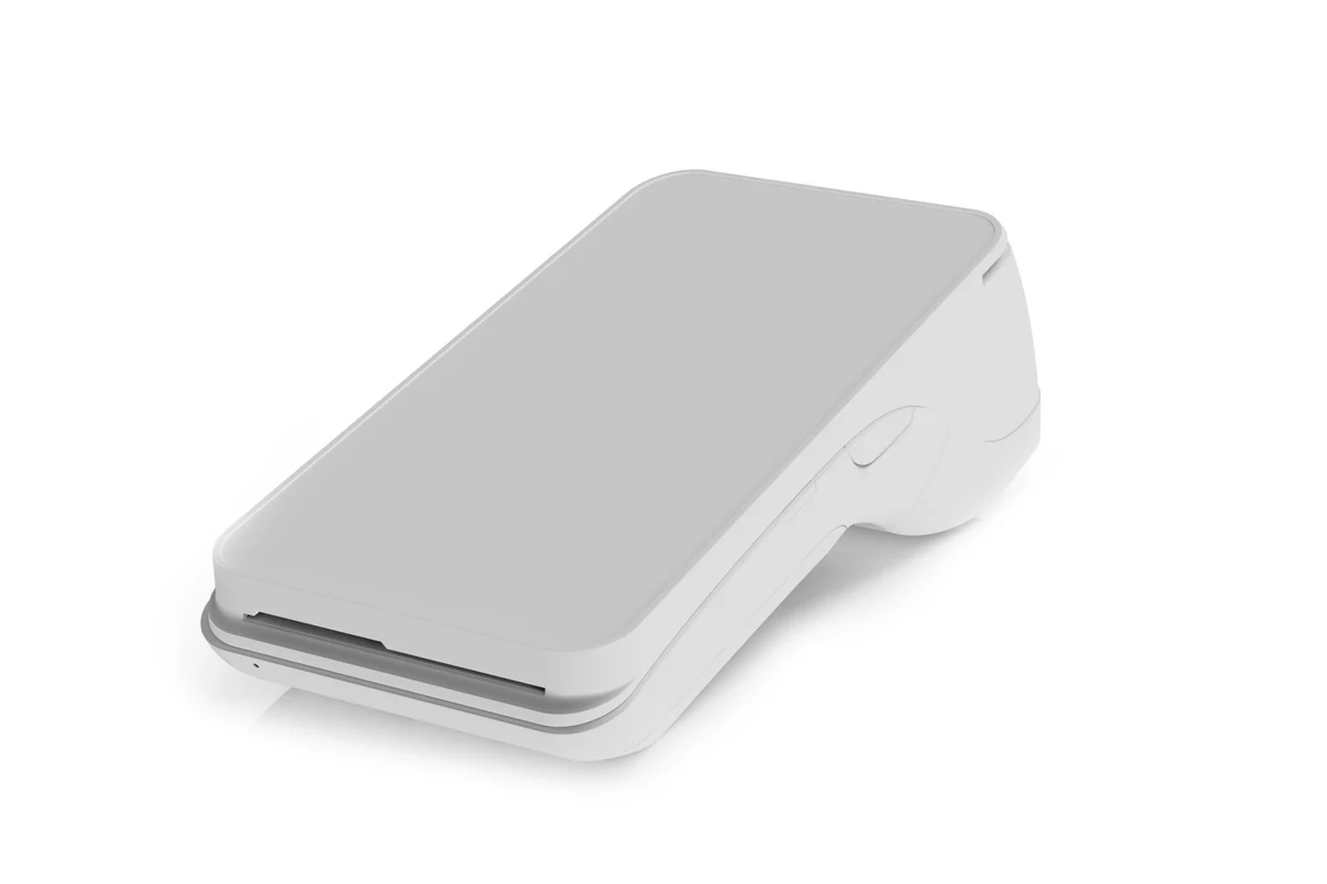
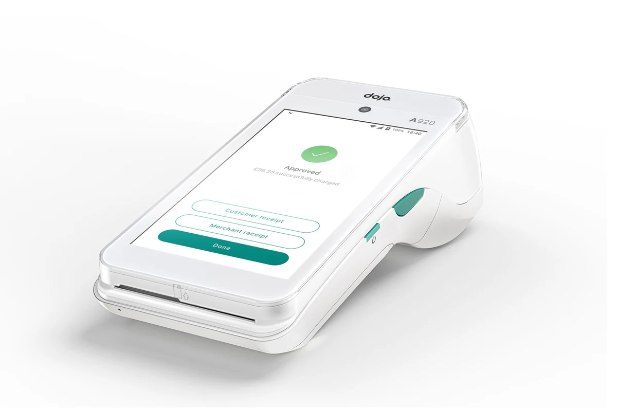
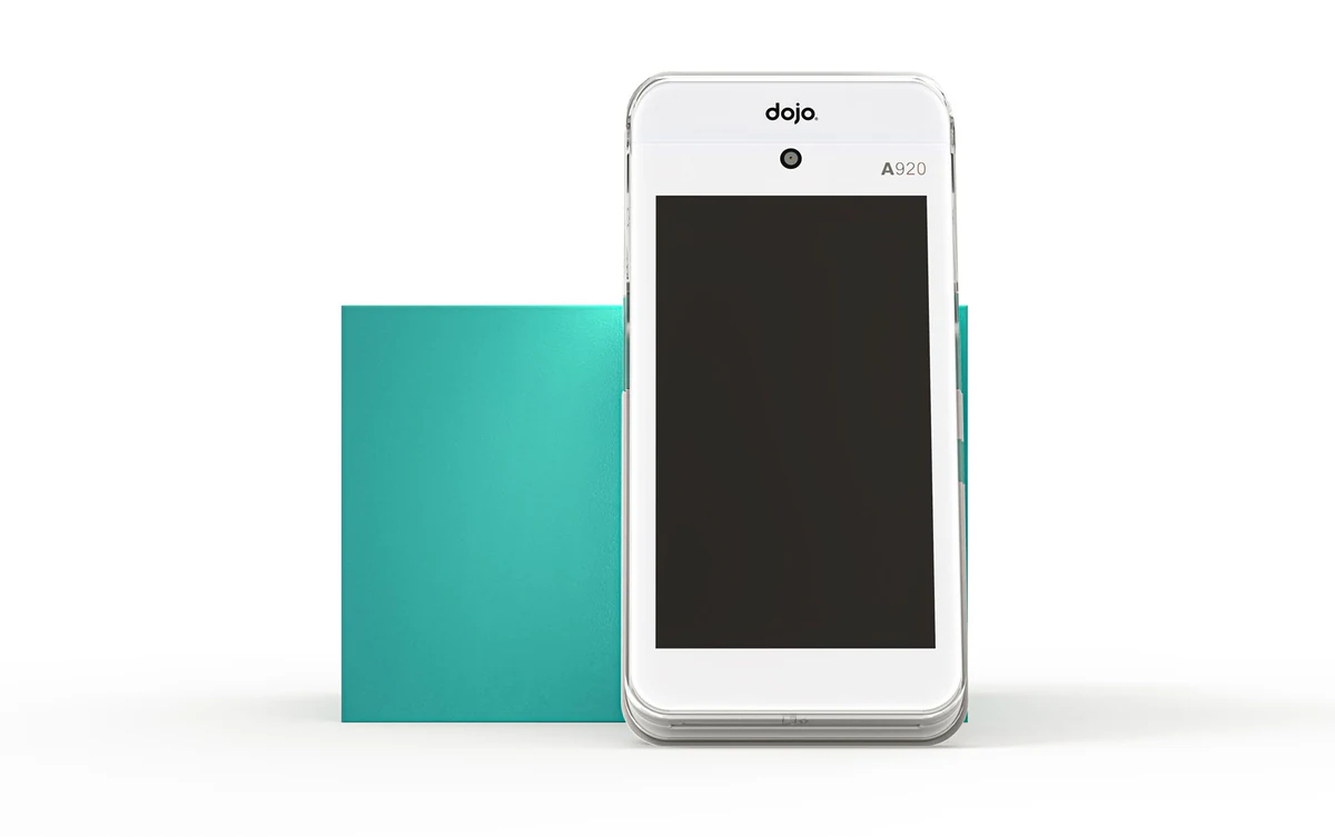
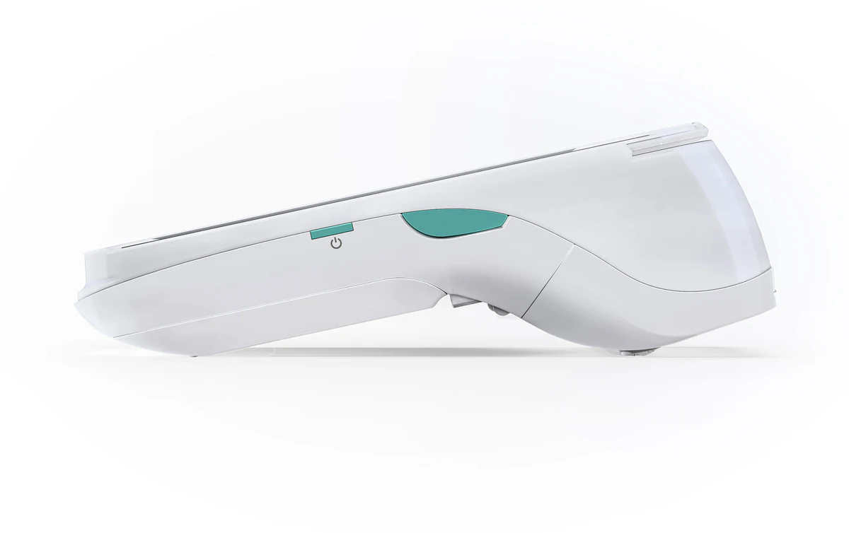
A library of clean silo cuts, front, iso, side, engineered for product pages, retail listings and partner decks where the device must read instantly without environmental noise.
Before / After
Photography vs. CGI, the resolution leap.
A direct comparison between Paymentsense’s legacy product photography and the final XO3D render, the same device, photographed and rendered to launch standard.
The deliverable
A full launch render library, built once, used everywhere.
A scalable CGI pipeline produced additional whitebox catalogue silos and macro detail frames, all consistent with the launch renders so product pages, retail listings and partner decks stayed visually locked.
Marketing-ready assets
Whitebox catalogue, additional silo angles
Detail shots, closeup/macro
Detail shots, additional macro frames
Macro Detail
Material precision at the macro scale.
Close-up renders on contactless top, product face and card slot, showcasing finish quality, button detail and engineering tolerance that photography couldn’t resolve.
Credits
The team behind the work.
Your next project
A brief of your own.
Use the Dojo Go project as a reference for the decisions you want to discuss. Identify the product detail, camera treatment or explanation that matters to your own audience, then scope the new work around your product.
A route to consider
Product CGI Films
A product film developed through creative treatment, storyboard, animatic, product review and final picture and sound.
Bring these three things.
- What is useful about the Dojo Go reference?
- What is different about your product?
- Where and when does the work need to appear?
Start with an outline. We review the product, intended outputs and timing before agreeing the production scope.
Related work
More from the studio.
Bloq.it
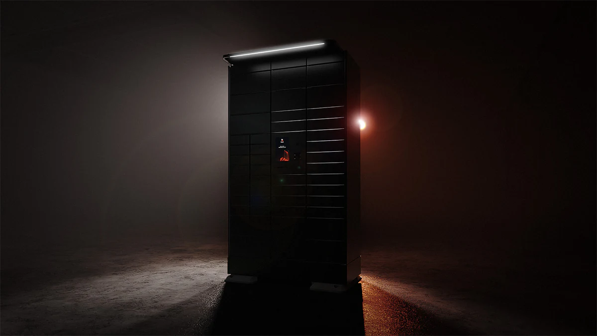
XO3D created 10 photoreal renders and a 54-second product animation for Bloq.it’s next-generation smart locker.
View case study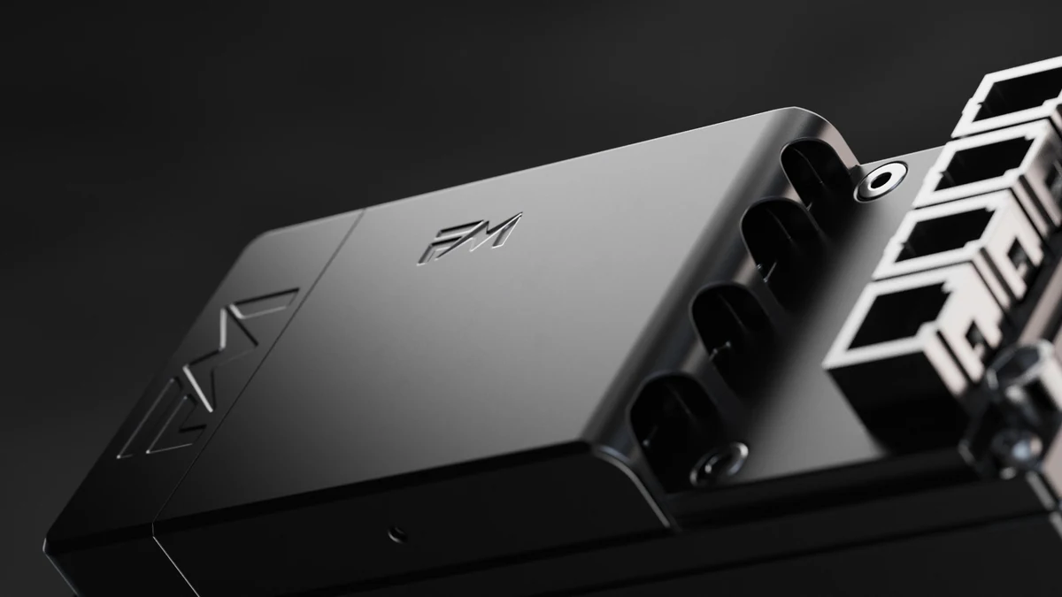
Flash Motors
XO3D created a 40-second 4K product film of Flash Motors’ Infinity X electric-scooter controller, one of two films for its CES 2024 launch.
View case study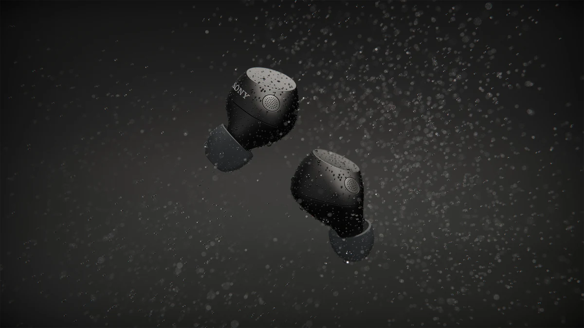
ImageNova · Sony
XO3D produced feature-led CGI for ImageNova’s Sony WF-C710 launch, covering colourways, water interaction, surface detail and product motion.
View case study
What made this project different?
Studio Commentary.
Paymentsense came to us because their existing photography couldn’t resolve the device detail at launch resolution, and they needed a visual language that could scale across product page, retail and paid social.
We built a single lighting language and a clean material study for the Dojo Go, then derived every asset from that source, hero lifestyle, catalogue silos, macro close-ups and float renders, all visually consistent.
The result is a launch library that gave Paymentsense full creative control over how Dojo Go appears in every channel, no reshoots, no inconsistencies, no compromises on detail.